What is responsive web design?
Responsive web design is an approach where a single website adapts its layout to the size of the screen it is viewed on. The same pages work on a phone, a tablet and a desktop without a separate mobile site.
How does responsive web design work?
Responsive web design works through flexible grids, flexible images and CSS media queries.
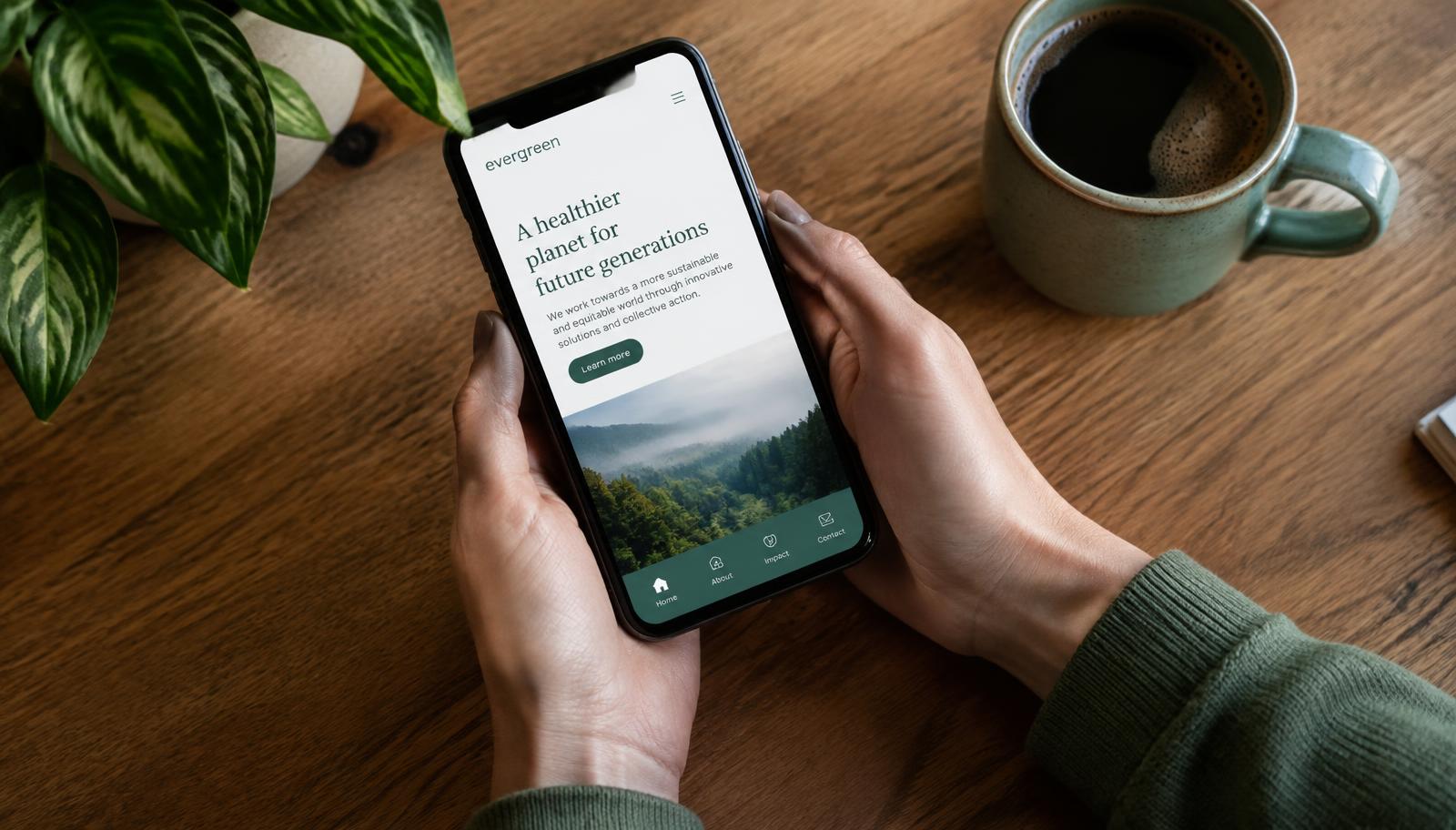
Media queries apply different layout rules at set screen widths, called breakpoints. At a phone breakpoint, columns stack, navigation collapses into a menu button and text sizes adjust for reading.
Why is responsive design important for SEO?
Responsive design is important for SEO because Google uses mobile-first indexing.
Mobile-first indexing means Google primarily uses the mobile version of a page to decide how it ranks. A site that is hard to use on a phone is at a disadvantage in search.
What is the difference between responsive and adaptive design?
Responsive design uses fluid layouts that stretch between breakpoints; adaptive design serves fixed layouts for specific screen sizes.
Responsive design is the modern standard because it handles the wide range of screen sizes in use today.
How do I test if my website is responsive?
You test responsiveness by opening your website on a phone and checking that nothing needs zooming or sideways scrolling.
In a desktop browser, narrow the window slowly and watch whether the layout rearranges cleanly. Check that buttons are easy to tap and forms are easy to fill in.